RagPiano.com - Guide to Sheet Music Preservation and Restoration
Sheet Music Preservation and Restoration
An Essay on Sheet Music Cover Art Restoration
by Bill Edwards:
Contents Copyright ©2002/2004/2015/2020 by William G. Edwards
A beautifully rendered Starmer cover digitally restored to its original hues.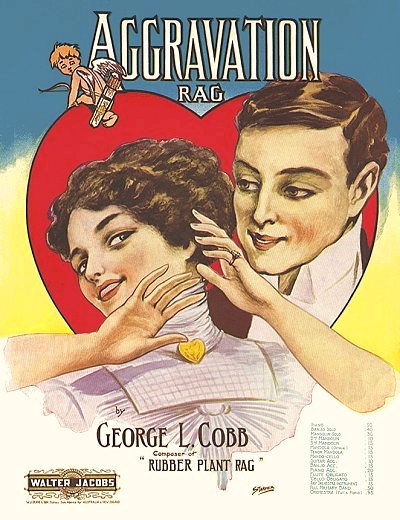 |
Among the questions I am frequently asked are those about the covers I have posted, such as what do I mean by "digital restoration" or how to take care of an investment in sheet music. This article will endeavor to answer these larger issues and many contained within. As always, further questions will be readily entertained.
Sheet music cover art during the ragtime era became a focal, and indeed selling point for much of the music produced. Between 1893 and 1920, the practice of putting catchy or simply beautiful imagery on the cover of a piece of sheet music to help it sell became a big business, and supported many artists from a variety mediums in the interim. Details on printing and artists are presented in my article on
Music Cover Art, as the focus here is on preserving this commercial art from our past. I will also explain as much as I can about the process of digital restoration without revealing
too many secrets about technique, but also so the reader can understand the value of this process and the considerable effort it often requires.
The first facet of business, aside from where to locate the music and how to pay for it at what amount, should be how to preserve what you have collected. In many cases, a sheet music collection is a considerable investment, and one that has appreciated greatly with the growth of Antique Malls in the last decades, as well as Internet Auction Sites such as eBay since the mid-1990s. It has also been fashionable since the outset to display much of the artwork on these covers in the home, and even in museums. Since most of the paper used up through the 1930s is biodegradable (as opposed to later plasticized glossy papers), it is a natural tendency for the material to degrade as time progresses. This causes obvious degradation of the color of the art as the paper tends to yellow, and even the inks used may fade over time. Anyone who has been through the Archives of the United States (or a similar facility in other countries where documents are stored or displayed) has noted how faded the ink on the Constitution and the Declaration of Independence is after 150 years of exposure to natural elements. In the last three quarters of a century these documents have been exposed to minimal light in a controlled atmosphere devoid of contaminants. Since this is an unreasonable environment to duplicate in the home, other steps must be taken to secure the music. Much of this depends on what ultimate purpose you have collected the music for.
If you collect sheet music as an investment, or even for display, it is likely that your pieces are in some sort of controlled environment. If it is stored, it is hard to emphasize enough the importance of polythene bags (available from on-line merchants and antique malls or shows) that are of the proper size to hold the music without folding or bending.
Large Format vs. Standard Format, which has been the common size since 1917.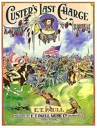  |
Large format music, the prevalent size before World War One, is approximately 9.75" x 13.5" (24.8 cm x 34.3 cm), which is considerably larger than today's more common 9" x 12" (22.8 cm x 30.5 cm) or 8.5" x 11" (21.6 cm x 27.9 cm). As has tragically often been the case with people who have either stored or mailed the larger pieces in the past (and sadly in the present), they have made certain that the music "conforms" to the desired size by either folding the pieces or *gasp* trimming away the undesired lengths. This, of course, renders a piece of large format sheet music virtually uncollectible in all but the most rare of circumstances. So properly sized storage is necessary. The bags keep the sheets from rubbing against each other, and help to avoid any ink transfers that might occur, as well as covers sticking together. You may often find pieces at antique malls that are already encased in plastic. Once you have purchased these, remove any adhesive tape from these bags as soon as is practical and before you remove the piece from the bag. There is a certain magnetism between the tape and the paper the music is printed on that tends to create new anomalies as the tape tears off a portion of the cover as it is removed from the bag. Don't store your pieces in bags that are taped either. Taping the bag closed is a good practice for shipping or sales display, but serves little purpose outside of that. The clear polythene music bags are also practical since music
can removed, but it is not necessary in order to admire the cover artwork.
As for storing, the music stands a much better chance of gaining longevity for your heirs if it is stored either vertically
A good quality sheet music cabinet. This has around 800 pieces in it and can marginally hold 1200 in bags.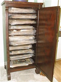 |
or in small horizontal stacks of 2" or less, rather than one tall stack. If you are not using polythene bags for storage and separation, the pieces on the bottom of a tall stack will tend to stick together or tear easily when the stack is moved, as sheet music is inherently dense and therefore heavy when stacked. If the music is stacked too high in poly bags it is not likely to stay that way for long, as the bags are quite slippery and even breathing on a pile will likely cause something to slide off, occasionally starting an avalanche to boot. So compressed vertical storage is the best route, or horizontal storage within a cabinet designed for that purpose (like the one pictured here). For vertical storage this means either the length or the width of the music can be on the bottom. If the spine is to the top it makes the music easier to remove from the storage container. If the spine is to the side, it makes viewing the titles on the covers easier. Most office supply stores have containers from cardboard boxes up to file cabinets that will hold legal-sized paper. Since there is headroom in most all of them, they will accommodate large format sheets on their side with little problem. Whenever possible, it is good to do all you can to keep the contents of a box or drawer of music flat on each side to prevent bending. A piece of hard plastic or even 1/8" thick wood can be used as a sort of bookend to help keep it straight. If you have a less than full container, something like bubble wrap or cut-to-fit foam can be used to maintain light pressure between one wall of the container and the bookend. Newspaper tends to compress over time, and the ink will come off in the container, so it is a less practical or desirable choice. For horizontal storage an alternate to the cabinet pictured here would be an office mailbox with slots at least 10" wide, preferably made of something sturdier than simple cardboard. It also allows for easier categorization or alphabetization. Try to avoid stacks of over 100 sheets at a time using this storage method.
In terms of environment, both extreme moisture and extreme dryness are detrimental to sheet music. In the case of many Witmark publications, which often are identified by text only the covers, the paper they used for many of their budget lines is so brittle that it crumbles at touch nearly a century later. So some steps should be considered to maintain the music in a less severe environment than is typically found in an in-ground basement or an attic. The general rule of thumb - if you are comfortable then so is your music. Too much heat while make it flaky, as will too little humidity. This is not always the case, as I discovered in southwest Colorado during my years there. I found that both pianos and music that had lived in this relatively dry region for a century were quite well preserved, as the humidity is consistently between 20% and 40% throughout the year. However, if either was brought in from a less stable climate then they would not last long, largely in part to the climatic changes. Paper that had become accustomed to moisture would quickly become brittle, and pianos would start to come apart at glued joints. Moisture is also hard on music, as it is on pianos. The average lifespan of a piano in the Hawaiian islands is less than two decades, while old sheet music in the garage does not fare any better in the moist air. So the best climate is on the dryer side, or at least consistently below 60% humidity, and within temperature extremes that are not uncomfortable for the owners of the music.
Many appreciate the artwork that graces the covers of pieces from the
E.T. Paull catalog, or they may want to display their valuable Joplin work prominently. There are guidelines to help with this as well. For starters, use the entire piece if possible, rather than tearing off the front cover.
Paul Revere's Ride, a good example of the colorful covers from the catalog of E.T. Paull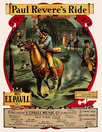 |
It will help to retain its value as well as create a better and stronger backing. Whether the piece is matted or not, use a glass front to keep dust off. There are some glass fronts and even high grade Plexiglas specially designed to filter out ultraviolet rays, and they should be considered if there is any sunlight exposure. Avoid direct sunlight exposure at all costs if you can. Even the expensively lithographed Paull works will fade and the paper will yellow. No matter the quality of the ink, these works are on paper and not canvas or plasticized textures, so they are subject to fading and yellowing much sooner. If you can seal the back with plastic wrap or polythene bags, this should further preserve the piece while allowing it to be admired by collectors and musicians.
For those of you who are actually using the music for study, learning, etc., consider the following in terms of preservation. Wear and tear are to be expected, but can be minimized, depending on how much you value the collection and the effort you want to invest in keeping it intact and retain its value. The less direct handling the better. Oils from the fingers can cause deterioration of the paper and even some transfer of inks in spite of the amount of time they have been bonded to the paper. While wearing surgical gloves when working with a piece is extreme, washing hands before and after a session would be advisable. It also helps to prevent smudging. If you really want to preserve your investment, you will either copy or scan in the pages one time. When I was building my collection of LP records (what are those?) in the 1970s and 1980s, my first action was to make a cassette of the record for playback instead of the original source. This practice has paid off in many ways over the years, either in resale value or in the ease in which I have been able to transfer the recordings to CD with little or no noise. Also, when you make a copy of music you can reduce the size and working footprint considerably. It is much easier to deal with large format music shrunk to 67% and trimmed and taped as one continuous sheet than to try and turn a 100 year old page on music nearly as wide as the music desk without causing some trauma to the paper. Look at where most of your older music is worn or discolored. It is usually at the opening edge or near the spine, but most pronounced at the upper and lower corners. No use, no abuse. Avoid making too many copies or scans of the original, as the intense light from those devices can also contribute to fading.
Whether or not your music receives frequent use, it still may need occasional repair. Depending on your ultimate goal for the music, be it for reference, display, archival or for sale, there are a few basics that will help any repairs from becoming detrimental to each piece. For starters - unless you really don't care about the results, standard grade cellophane or transparent tape will not be in your toolkit. If you have any music that has been repaired ten or more years ago, you will note that there is a great deal of yellowing or even browning that occurs with this variety of tape. While higher grade satin tapes, such as Scotch MagicTape™, have a much increased chance of not becoming discolored, application of this adhesive should be done with much prudence. The best alternative, if a bit more expensive, is archive or preservation tape, which is acid-free and designed specifically for preserving old documents with minimal impact. This and similar tapes should be available at many office-supply vendors or through used book dealers.
Since the ultimate goals are to keep the music from falling apart while making it readable and preserving the cover, application methods should be fairly obvious and straightforward. Helpful details are harder to come by in this process, so here are a few.
- When taping a page that has the cover on one side, always favor the back side of the cover. In the case of the tape coming off and tearing or scarring the paper, it is easier to restore a bit of the music with a pen than it is the cover.
- Use short pieces as even fairly straight-looking tears may have some bend to them, and it is hard to work the tape around the corner of a bend without some wrinkling or dimpling of the tape, and unnecessary stress on the music at the bend point.
- Always apply tape on a smooth non-stick surface, such as a wooden table or Formica counter top.
- BEFORE applying the tape, carefully examine both sides of the tear to make certain any feathering is pulled out and overlaid in the proper place. Many repaired tears are unnecessarily ugly because even though all of the page material was available, the feathered part of the page may be behind the tear rather than in front of it.
- Apply pressure to the repair with minimal rubbing, if possible. A miniature wooden roller or a wooden or metal spoon works fairly well for this. Rubbing hard can create ink streaking or tears, and use of a tennis ball or paint roller can leave fabric residue under the tape.
- For feathered edges on the non-taped side, a very sparse amount of a light non-coloring adhesive, such as white glue, may be applied just under the feather with a toothpick, then carefully pressed down using the method above, or from the back side.
- FOR A SPINE SEPARATION always tape the inside of the spine using wider tape at a minimum of 1" (2.5 cm), and preferably 1.5" (3.75 cm). Lay down a second strip of equal or lesser size to reinforce. Cloth tapes are fairly good for inside spine repairs.
- If not all of the original paper is available on one side of the tear, small strips of tape will be necessary on the opposite side of the repair to prevent sticking to any other materials. These should be marginally larger than the missing area so as to adhere to the paper as well as the exposed tape.
For reasons of vanity, identification, necessity, lack of foresight, or a tendency to doodle on the part of a previous owner, many old pieces of sheet music have pencil marks on the cover or worse, such as ink or store stamps. The rubber stamp imprints may actually add to the value of the music, but the owner's markings (short of those of the composer or some other important figure) absolutely detract. If it is indeed ink then removal is not an option. For pencil markings there are some possibilities. If the pencil is on an area of some graphic density, or the paper is obviously fragile and prone to tearing, do not attempt the removal. If the pencil is on an area of the music that does not have featured cover graphics, removal may be attempted. Avoid using a traditional pink eraser, separate from a pencil or otherwise, at all costs. The best tool for this delicate job would be a drafting or polymer eraser. These are typically white rubber or polymer, and require less pressure than others. Keep in mind that you may be attempting to erase actual pencil lead which is harder to remove then the common graphite compounds which have been used since the 1930s. If you can try the eraser on a test area first, such as inside the back cover and where there is no music, you will get a better perspective as to how well the eraser might perform. This is in no way a direct endorsement for attempting this procedure on valuable pieces of sheet music. It is simply a learned suggestion for you to ponder and apply with jurisprudence.
If recent history is any indicator (and hindsight is often a good tool for obtaining foresight), sheet music from the 1890s through 1930 will likely retain its current value or increase as it becomes less available. Whether you intend to keep the music as an investment or use it as a reference, keep in mind that some future generation will likely value it as much or more than you do. To this end, preservation of valuable sheet music is one form of legacy you can leave for the future. That is, as long as you don't write your name all over the cover!
Rare first edition of Ragging the Scale.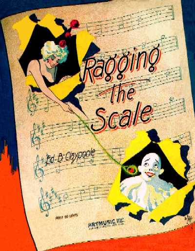 |
We will now move on to the topic of Digital Restoration. RagPiano.com was created largely out of the initial need to restore and/or colorize some sheet music covers for use on CD recording covers as well as on the CD. Where an original cover was not available but a color picture of it was, and a monochrome (black and white) rendition of it existed in a folio, the goal was to colorize the monochrome rendition into a color one with a fairly high level of accuracy. In the case where the original cover was available, as well as the colorized copies from a folio, there were still many artifacts that did not exist when the music was new. These include tears, folds, water stains, smudges, uneven color fading, missing pieces and edges, store stamps, and the ever-present mark of the original or secondary owner (with all due respect and kudos to the late
Trebor Tichenor and the late
"Ragtime Bob" Darch who engaged in this practice but contributed ever so much to ragtime knowledge and awareness in the process). The goal was to digitally restore the covers to a state equal to or, in some cases, better than the original publication as it rolled off the presses.
DIGITAL restoration means storage of the cover image in electronic format for electronic display or for a printout. Much in the way that CGI (Computer Generated Imagery) has enhanced the presentation of special effects in the world of cinema where these effects would otherwise be nearly impossible to duplicate physically, the application of CGI (Computer Generated Improvements) to art, photography, etc. has opened up a world of restoration possibilities that were previously either not available or exceedingly difficult to do physically. For starters, the original lithography plates for many of the more stunning covers, such as those from the
E.T. Paull catalog, are either destroyed are long forgotten in some storage area. In many cases, time has simply taken a toll on the plates and they have deteriorated. Duplication of exact ink colors would also be an issue, even with today's available computer technology. In many other cases, such as small runs and vanity publications, the plates were destroyed through the process of recycling the metal. So digital restoration provides a venue that can be readily made available to anybody with a computer, or even through printouts, for the continued appreciation of an era when a great deal of work was put into the presentation of music through eye-catching cover art. While the value of this is controversial to some who consider it altering history or creating something that never quite existed, it is not designed to replace historical documents, only to provide an alternate perspective of them.
Without revealing too much about the actual proprietary processes and methodologies used to create restored images, we can still go through a basic overview of the tools used and view some before and after pictures that help to validate the end result. Before you enter into any repair or restoration process of any kind, an inventory needs to be done of both physical and mental needs. For this specific process, the tools necessary to do a good job include the following:
- A relatively fast computer (most built since 2012 are quite adequate) with 2gb or more of memory (4 on Windows 10) since processing times on large images are largely constricted by memory.
- A large high quality flatscreen monitor (17" or greater) capable of high resolutions. Computer desktop video resolutions of standard HD (1080x1920 pixels) or greater tend to make detail work easier as more of the image can be seen at one time using a higher magnification. Additional software color adjustments in the drivers will help with proper color calibration. Newer flat-screen LCD monitors are particularly good for this type of work. I use an HD monitor in portrait mode (90° rotation) so I can see more of the artwork at once.
- Lots of drive storage, particularly while working with the images (archiving them is a different matter). Some images can occupy up to 32 mb depending on scanned resolution and depth. USB 3.0 drives of a terrabyte or more are now commonplace and inexpensive.
- A high-resolution flatbed scanner capable of 600 dpi or better. Even if that resolution is not used, lower resolution scans made on these models tend to be more accurate due to higher-quality optics, motors and belts. USB 2.0 connectivity provides relatively fast connection and does not occupy all of your computer's resources while scanning.
- A well-lit work area is necessary, avoiding glare on the monitor but allowing for comparison of color between the original and the copy.
- An accurate mouse that is set to a motion speed which allows accurate tracing without too much hand motion. This is a matter of personal ergonomics, but depending on the quantity of work to be done, repetitive motion injury possibilities should be considered. A pen or track ball may be used as an alternative, but both have drawbacks in this particular type of work. Mouse touch pads or IBM style nipple buttons such as those found on laptops and some full-size keyboards are simply not acceptable. Optical mice tend to have the highest degree of accuracy when used on a patterned surface and don't require constant cleaning.
- Two or more varied graphics-manipulation programs. Experience dictates that certain programs do certain operations in much more logical ways, while lacking other needed functionality. There is no one tool for the job, but keeping most operations to two or three tools will minimize the learning curve and necessary processing time.
- Infinite patience and creativity. This is a process requiring logic and knowledge to know how to proceed, as well as the creativity to imagine and fill in what may not be there at times, and a vision for the desired end-result. If medication is needed to keep the hand steady and/or the mind focused, it is adamantly recommended.
We will start with the process of restoring a color sheet music cover. The cover used here is for the famous Kerry Mills piece Red Wing. There were three copies available for this scan (shown below), so the first order of business was to find the one that would require the least work. This includes worn edges (prevalent on the center copy), poorly applied tape (a problem with both the center and right copies along the spine) and color fading (again on the center copy). Sometimes there are other minor differences. The signature of the artist, Hirt (located to the right of the ponytail below the title R), was less visible on two of the covers because it was printed with only yellow ink. The third cover (right), although slightly faded, had the signature in blue ink and contained the best continuity of the three. In some cases where more than one cover is available, both may be scanned and the best portions of each them used. This requires a great deal of extra effort to maintain color matching and rotation continuity, but it is occasionally the best route. In this case, the cover on the right was the primary source, and the cover on the left the secondary source, mostly due to better color continuity between the two.
Three different covers for Red Wing with varying degrees of wear and artifacts.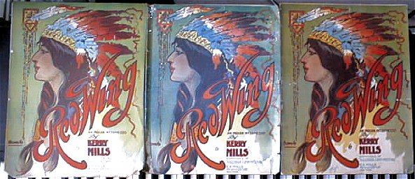 |
Once the piece has been selected and any necessary physical restoration done to the cover, it needs to be scanned into the computer. The ideal tool for this is obviously a large format (11.5" x 17.5") scanner, which will negate the matching steps below. They have also come way down in price in the 2010s, so are easier to obtain. However, if that tool is not available and you are using a standard format (11.5" x 9") scanner, some of the additional steps below will clearly apply.
Since large format music is larger than standard scanner beds, the cover obviously needs to be scanned in two parts. This is best done sideways (-90° or 270° rotation) with the spine aligned along the top/back of the scanner bed, and just a little bit of space between the top/bottom of the piece and the left/right edge of the scanner bed. A well repaired or good-condition spine is necessary to ease the alignment of the two scans, as it is the best possible guideline for squaring the piece. The resolution you scan at depends on the ultimate use of the image. Larger resolutions make for much larger file sizes and memory use, require a great deal more detail editing, and tend to be slower to work with. They are great for printing, however, as they are closer to print resolution and don't introduce anomalies like pixelization, stair-stepping or blurring. Lower resolutions often create banding or unwanted patterns due to differences in the dot patterns used in the printing process and those picked up by the scanner. They are insufficient for printing, but good for low or medium resolution video display. A good starting resolution is 150 dpi (dots per inch) for editing geared towards display or reduced-size printing, and 300 or more dpi for full-sized printing. If your scanner software does not provide a specific resolution or you are unsure, just pick the resolution for your printer (usually in a drop-down box) and scan at 50% size. A large scan can always be resized to a manageable resolution with little loss.
Make certain that at least one or more minutes have passed between pre-scan or test scan and your actual attempts, as light temperatures tend to change a bit during warm up, particularly as the scanning lamp ages. Select an area just a bit larger than the music for scanning, and maintain that area for both halves. If you can apply filters in advance, avoid anything that will blur or over-sharpen the image. Some scanners have an average setting which should work well if a filter is needed. Try to scan the second half as soon as possible after the first to maintain similar color temperature between the two. Make sure that the scanner lid is pressed down on the music to keep it flat, even with a book on the lid if necessary to maintain steady pressure. After the first half is completed, slide the music over to the other edge to finish the second half. Then, leave the music in place for the moment. Don't move it. You may need to do exactly that soon enough.
Now in the graphics editor that you scanned from, rotate each half-image 90° to the left (or -270° to the right) so it is upright. Average size for large format scanned at 150 dpi will be around 1300 pixels wide. You may resize this down for easier maneuverability, but an identical size needs to be used for both halves. Sizing each piece to 1000 pixels wide or so is a good working width. Using an adequately sized new blank image, copy and paste in the top half of the cover. Then select as much of the bottom half of the cover as you need and paste it into the new image, making certain you have enough viewing area to work with the line where the halves should match. For this purpose, I use the Paint program built into the Windows operating system since it is fast and flexible, and it does not interfere with the program in which the original halves are loaded from the scanner. Keeping the lower half of the image selected, drag it around with the mouse until there is a definitive match between the halves. This is where discernment is very necessary. If one side matches and the other is off by a few pixels, note which side is off and by how much. Then delete the selected lower half. If the software from the graphics editor with the scanned images allows it, try to rotate the original image half in tenths or even hundredths of a degree, applying the sharpen filter each time, and undoing both rotation and scan if necessary to start a new one until there is a match. Otherwise, you will need to go back to the scanner and very carefully rotate the music in the correct direction just a little, projecting the difference as if you were looking up from the scanner bed, and redo the scan. Repeat the above process until the match is either perfect or can be easily manipulated through editing. THEN you may remove the music from the scanner. Note that graphics programs rotations in tenths of a degree may work well in some cases but poorly in others, and may create some new artifacts or matching anomalies. If you prefer this method over rescanning then use it as a viable alternative.
To do the actual match it is less than ideal to paste in the entire lower half, particularly since the edges of some scanners tend to read just a shade darker than the rest of the plate, in part because the music is lifted up slightly from the scanner bed onto the bevel around the glass. It is much more prudent to select most of the lower half, looking for an obvious point where minimum distortion might occur in a less-than-perfect match. This means avoiding a selection through the middle of a face, fancy design, or even small words whenever possible. For Red Wing, this meant a line beneath the top half of the "g" in the title, and well below the chin of the maiden. The end result will make this effort worthwhile. If you can barely tell, or even better if you can't find the line, then virtually nobody else will be able to. In some cases, there may be some minor color or contrast distortions. Only after you have had some experience with the basic process of matching images would you want to explore the capabilities of your image editor in this regard. Usually some delicate adjustments in hue, saturation or lightness will overcome these minor differences between halves. Once the halves are matched, select the entire image and move the upper left corner to a place which best aligns with the image frame. Then you may adjust the canvas size, either with the mouse (depending on the program) or through a menu-item adjustment, until the lower right corner is similarly aligned. At this point - SAVE YOUR WORK. If you want to resize the new image to a smaller resolution, now might be a good time to do it. However, the smaller the image, the less accurate the alterations will be, even though the work will go more quickly.
When scanning a monochrome image out of a folio, the above process is greatly simplified since it can usually be done in one take, allowing for adjustments in alignment. Most scanners allow for a grayscale scan, which means the image is translated to a monochrome palette. This will ultimately create better information to work with if any attempt is to be made to colorize either the whole image or portions of it. If your scanner software does not provide for this, many graphics editors can do a quick grayscale conversion. Since 8-bit grayscale consists of 256 shades of gray from white to black, it also makes for smaller file sizes than 24-bit full color images.
Once you have your completed image, you will possibly want to clean it up, removing all the little scars and artifacts that time and use have wrought. You will also want to do this with a grayscale image, as it is much easier to colorize an edited image than edit the colorized image and retain the proper color blend. The process of cleanup is the methodology that I prefer not to reveal at this juncture as much of it is proprietary and falls in with specific skill sets and tool modifications. However, I will tell you that there are many possible methods for editing out or covering up artifacts without changing the nature of the original cover. I use three different editors with several different capabilities to work through this process, and even with experience, extreme patience and diligence with respect to detail are required. One hint, if the program you are using has only three or so steps of undo, you may want to save at specific stopping points so as to have something to recover if your editing effects go awry. You may also need to work with mouse calibration, and even mouse methodology in order to maintain control over your work. What exactly is removed or added is up to you, but if preservation is the desired result, it should be done with the utmost of accuracy as best as can be determined. The copy of Red Wing that I used had ragged edges, some tape on the left side, a fold down part of the right side, a small bit of tape damage, darkened edges, and faded color. A little reconstruction work was required where information was missing. Compare the before and after results below to see what has been altered and what has been retained.
Before restoration: creases, tears, dirt, and washed out color. After restoration: no obvious artifacts and more vivid hues. 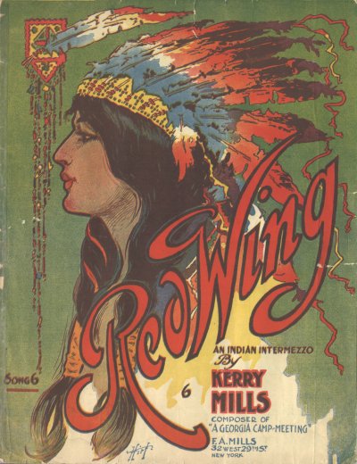 |  |
Once the picture is sufficiently cleaned up, and checked in a magnified state for the level of detail that is satisfactory to you, enhancements may need to be applied in terms of hue and light levels. The order in which they are applied can affect the outcome, so experimentation is necessary, as results will vary depending on the original source. First, be honest in your assessment of the original source in terms of the level of color or brightness fade it has encountered. Some covers were poor in this regard when they were first printed. Others have faded unevenly due to light exposure, and it is easier to determine what is closer to the original intent. Keep the original source handy and in a good light when doing this work. Many possible color filters can be applied, including color saturation, gamma correction for any or all of the red/green/blue bands, color tables, allowing more finite control over the alteration of color spectrum, and general hue alteration which pushes all color bands one direction or another. If a piece is a bit faded, increasing the saturation can often restore some color, as was applied in the restored version of Red Wing. For light levels there are brightness and contrast controls (sometimes known as window and level) as well as individual manipulations of light, mid-tone, and shadow frequencies. This latter method was used on Red Wing to bring out the darker frequencies without altering the lighter ones, providing better definition. There are also filters to sharpen the picture, but these should be used with caution, as any artifacts may also be sharpened, and therefore accentuated. This particularly includes patterns inadvertently applied during scan due to pixel misalignments.
Before restoration: Accumulation of dirt on non-inked portions is evident. After restoration: Paper is rendered off-white, bringing out original ink colors.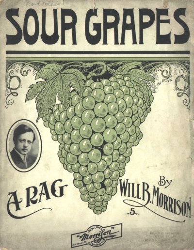 | 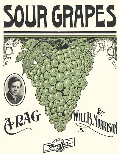 |
In many cases, dirt and fading are the issues to deal with. Many older copies of music that have not crumbled have at least yellowed or turned some shade of tan. In some cases the original color of the sheet was indeed off-white or light tan. However, in many more cases the original paper used for printing was pretty much white. You can sometimes predict what kind of age pigmentation has taken place by checking the type of paper used. Non-coated papers tend to turn more towards the brown spectrum, while coated papers either turn more towards yellow or accumulate more dirt. Such is the case with Sour Grapes shown above. The cover is on coated paper that has attracted a great deal of dirt over the years, particularly on the edges. Note that less dirt will accumulate on the inked parts of the paper, leaving the colors on these parts of the sheet relatively accurate. For yellowed or tanned sheets some compensation can be made with a good graphics program that will render the colors closer to their original hue. For the remainder of the cover, the parts not covered with ink, a uniform color can be applied that will not be out of character with the original printing, and can revive the colored parts as well. This technique was applied to Sour Grapes where all of the non-inked portions were taken down to a shade of off-white. Using absolute white is not recommended as it does not render as accurate an image, and can make the contrast between inked and non-inked portions look falsely exaggerated. This may require a high level of detail work, even down to the pixel level in some places, but the end result is a marked improvement in visual quality. It also helps drop the number of colors in the palette, which can have a significant effect on file size.
Before colorization but after image cleanup. After colorization. At least four different color masks were used for this composite.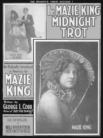 | 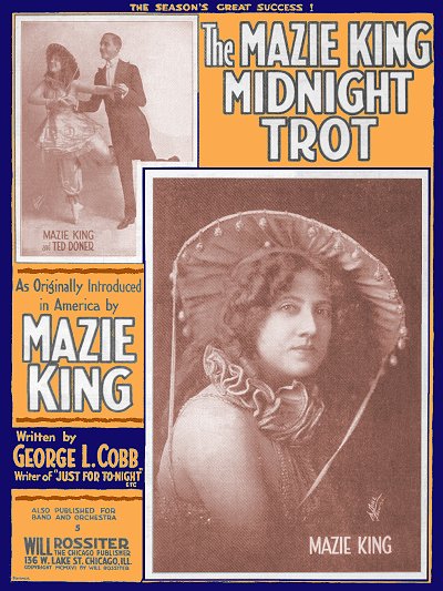 |
To colorize a monochrome image, which is again a proprietary process that will be lacking in detail here, it is very useful to have at least a color photograph or some other clue as to the original hues. Many pieces of music were printed using only a black plus one or black plus two-color process. These are easy enough to work with, and some image editors have good flood tools that will provide some semblance of shading. In other cases, a simple colorization filter can be applied, rendering the image entirely in a particular hue with 256 levels (8 bits) of color gradient. For those of you who are more ambitious, separations can be made and applied to created a pseudo-color effect. This means creating layers from the original image in which each layer contains only the elements for a particular hue. Each layer is then colorized to approximate that hue, then all of the layers are transparently pasted back onto the original monochrome image, creating a compositely tinted image. Since many early photographs were hand tinted using similar thinking, this is a process that can create pleasant results, although usually something short of the original color image. I include one example here of an image that was colorized using this process since an original scan was not available to me. It is the Mazie King Midnight Trot, and while I did not have the original colors at hand when I originally rendered it, experience dictates some of the probable color combinations in use at the time, as well as methods in which photographs were tinted. In some cases, the colorized covers actually have a bit more appeal than their real-life counterparts. In any case, when the correct colors are made known to me, I generally revisit the cover and correct the hues. In this case I soon found I was more than just close enough, and so left this image alone.
Sheet music cover art is often as worthwhile of preservation and display as the works of other great masters. It is a peek into the past, and much of the time the art reflects unique views or common trends of the period in which it was produced. If not for sheet music covers we may not have had even the limited number of photographs of Scott Joplin that now exist. Much of the culture and lifestyles of the early 20th century that did not make it to black and white cinema or color film did make it to sheet music covers. As they age, their condition won't improve any. So whatever steps you decide to take to preserve these historical documents, make them prudent and viable steps in the hope that the generations you or I hand them down to will treasure and respect them as much or more than we do. It can be a notable part of your personal legacy.
Bill is always open to comments on this or related topics, as well as suggestions. While certain details will not be divulged due to the eventual hope of patenting some of the processes and tool designs, a general discussion of how to work with sheet music will most certainly be responded to. You may mail Bill at

for more assistance. Also take a quick look at my
FAQ page to see if your question might be answered there. Thank you.


 Loading Page. Please Wait...


 Click here for more space
  Click here to expand menu


